A dashboard for progress
Going beyond GDP
by Jason Crawford · March 20, 2021 · 3 min read
Is progress slowing down? In a previous post I explained why I got convinced that it is. Some people making this argument point to quantitative evidence, such as GDP or total factor productivity. I gave more qualitative evidence, or perhaps very crude quantitative evidence, by counting technological breakthroughs/revolutions: five in the Second Industrial Revolution, versus only one so far in the Third.
But this approach has its own difficulties:
-
It is sensitive to the granularity of technological revolutions. Are the automobile and the airplane two revolutions, or are these just part of a single revolution attributed to the internal combustion engine? Are the light bulb and electric motor two revolutions, or are these just part of the electricity revolution? Are computers and the Internet two revolutions, or one?
-
It’s sensitive to the choice of threshold for “revolution.” Is the assembly line a revolution in manufacturing? Is containerization a revolution in transportation?
-
It runs the risk of focusing on impressive breakthroughs and neglecting unglamorous iterative improvement. Agriculture has been using combine harvesters pulled by gas tractors for around a century now, but today’s combines are much better than the ones in use a century ago.
So maybe we need something more objective, and more focused on outputs. Here’s a half-baked idea.
It’s easy to measure progress in specific domains. For instance, we have a very good handle on the progression of Moore’s Law. The problem is that no one narrow metric captures all of economic progress.
So instead of trying for a single metric, what if we look at a dashboard comprising a handful of metrics. Make them as broad as possible while keeping them objective and well-defined, and deliberately choose a variety from across the breadth of the economy. These won’t capture everything, but together they might capture enough to give us a picture of progress.
Here’s a candidate list:
- Per-capita consumption of:
- metals
- concrete
- plastics
- energy
- bandwidth
- Per-capita transport (all modes):
- passenger-miles
- freight ton-miles
- Agricultural productivity, in kcal per worker
- Mortality rate from all causes (age-adjusted)
Most of these are just consumption metrics, based on a simple theory that consumption is good and is closely correlated with material well-being. For agriculture, I chose a productivity metric, because of the nature of the market: we only need so much food, after which point progress has largely been made by providing it with fewer people.
Some goals this set of metrics satisfies:
- Broadly captures trends across manufacturing/construction, agriculture, energy, transportation, information, and health
- Avoids any currency figures, and thus avoids any questions about inflation or purchasing power
- Captures the impact on human lives, by using per-capita figures
Some ways in which this approach is not perfect:
-
Does not capture quality. The products made of metal or plastic today might be much higher-quality than fifty years ago, but we’re only measuring the total amount of material.
-
Does not capture well-being. Maybe you’re traveling more passenger-miles because your commute is longer, and that actually reduces your well-being, but the passenger transport metric has increased.
Still, no metric or dashboard is ever going to be perfect. I think this dashboard would, if nothing else, provide a useful comparison alongside GDP.
One reason I think it would be useful is that I can imagine it changing my mind, or at least altering my narrative, around progress/stagnation. If there are no fundamentally new manufacturing techniques, but we’re continuing to consume exponentially more materials on a per-capita basis, isn’t that a form of progress in the manufacturing realm? Ditto if there are no new types of vehicles, but we consume more passenger-miles or freight ton-miles.
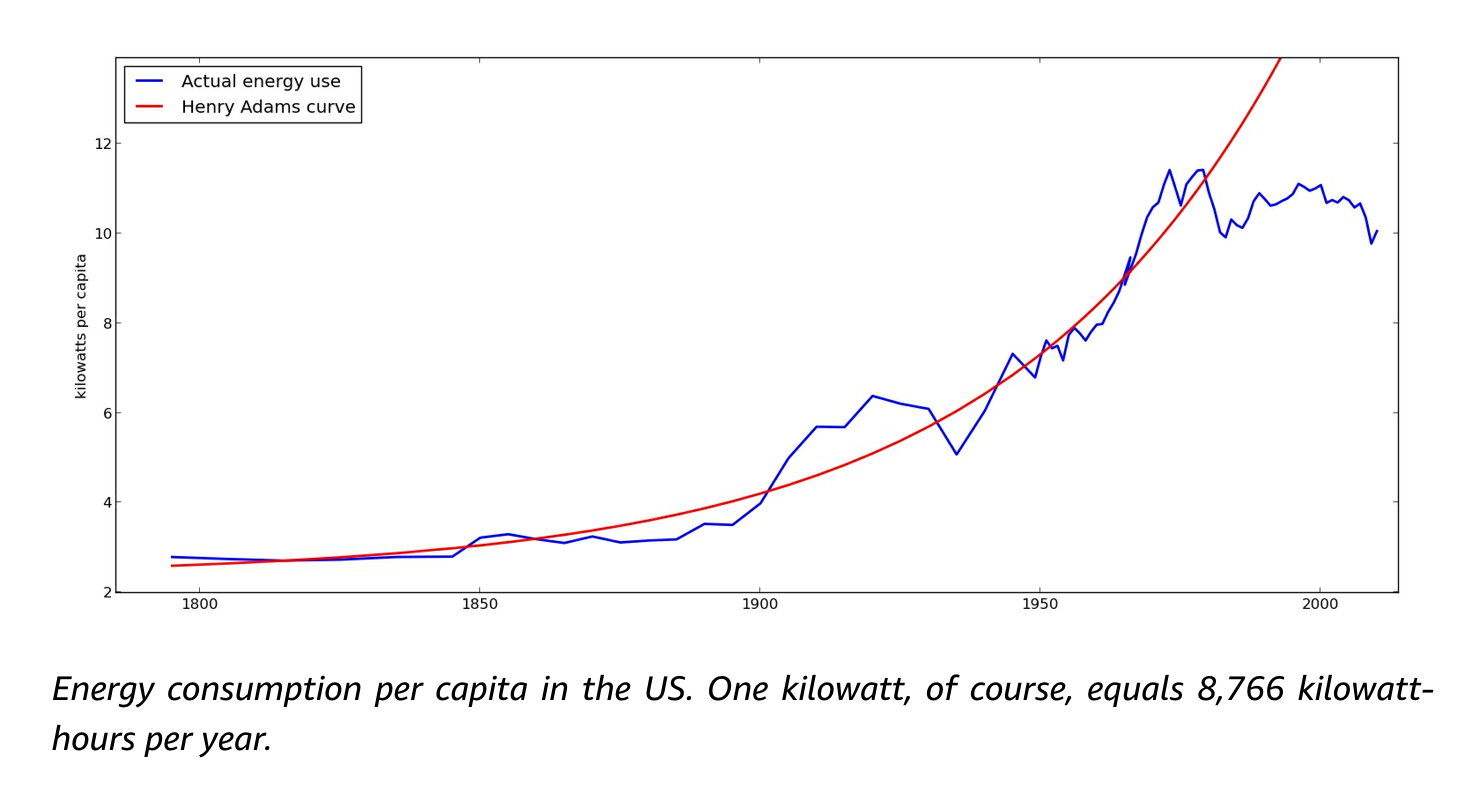
I happen to know two of these metrics, from previous research, and both have stagnated. Here is energy, from Where Is My Flying Car?:

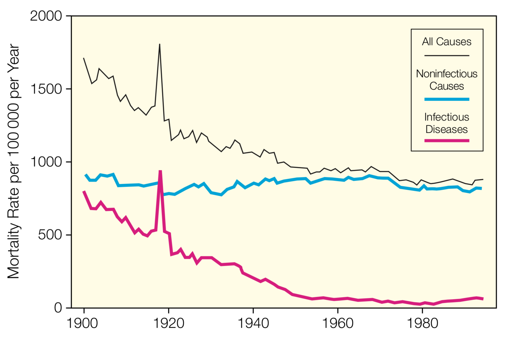
And here is mortality, from my research on infectious disease. Infectious disease mortality actually regressed slightly after about 1980 (due in part to AIDS):

I’m curious how the others turn out.
