Charting progress
by Jason Crawford · July 11, 2017 · 1 min read
Here’s something I’ve been working on: summarizing human progress in a sort of timeline/chart.

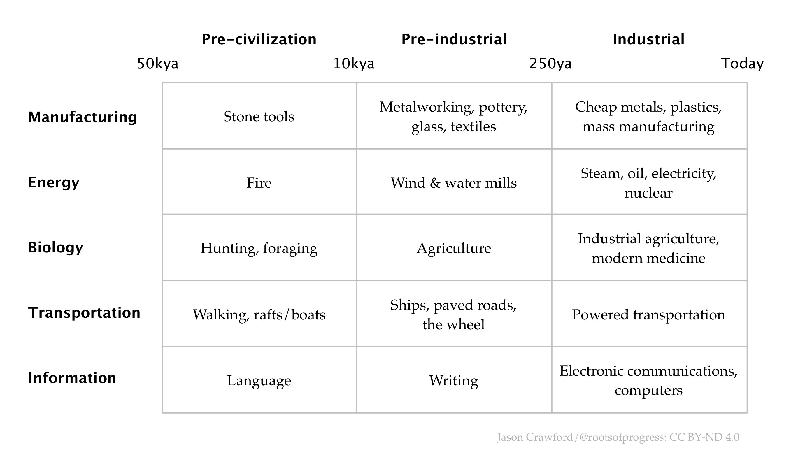
This one charts progress in technology and production.
On the vertical axis I have five categories: manufacturing, energy, biology, transportation and information. This is the categorization I’m working with now, only slighly evolved from the one I discussed recently.
The horizontal axis is time. I’m dividing all of human history into three broad eras:
-
Pre-civilization, stretching from the beginning of behaviorally modern humans 50,000 years ago until the development of settled societies and agriculture
-
Pre-industrial, from the first civilizations to the start of the Industrial Revolution
-
Industrial, the modern period of developed industry
Very roughly, the first is the Stone Age, the second combines the Bronze and Iron Ages, and the last is the Industrial Age or Industrial Revolution.

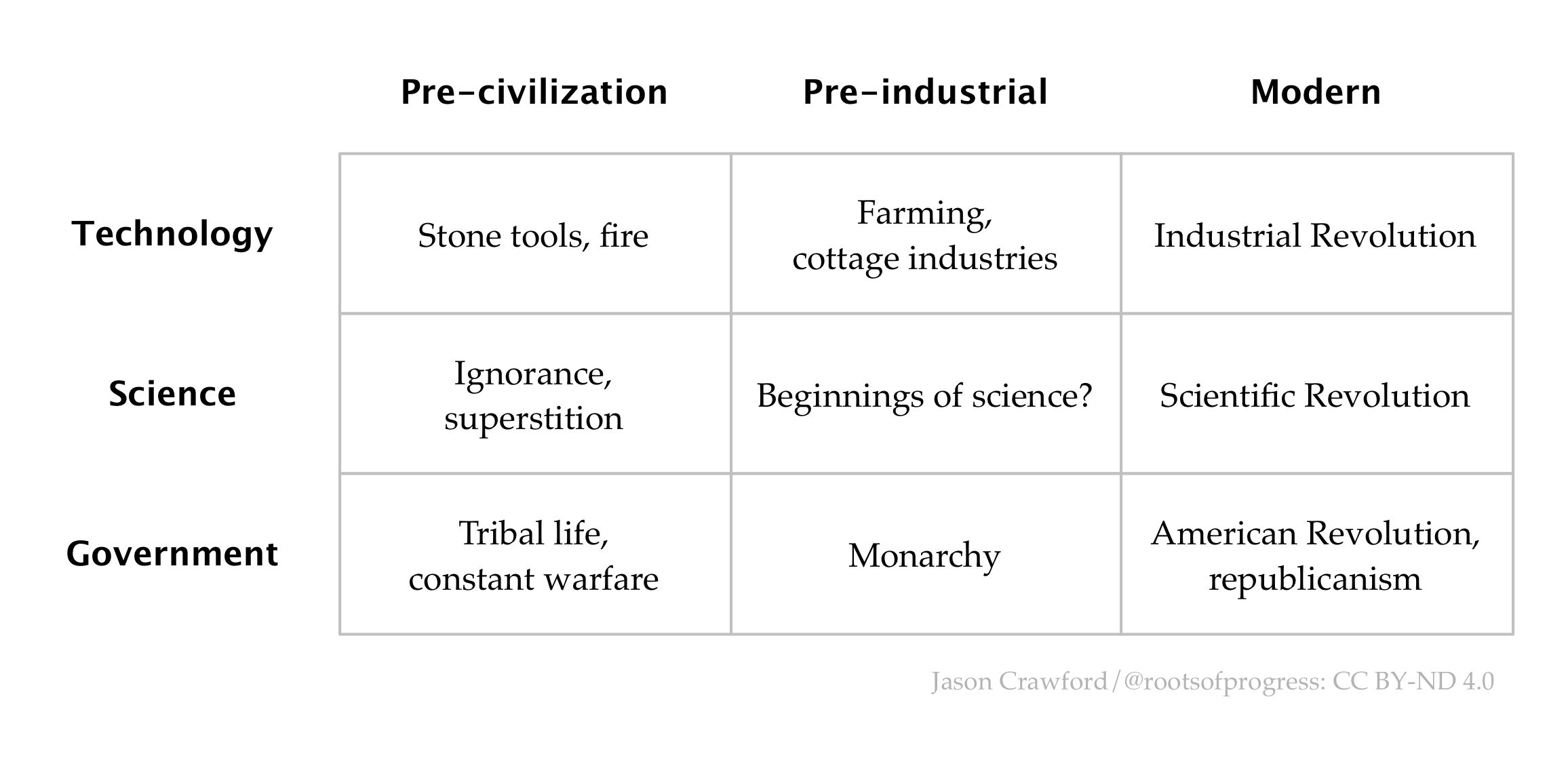
In this one, I’ve zoomed out. The whole first chart is condensed to a single row. This is the overview of human progress. Now, the vertical axis separates the three broad areas I see: technology, science, and government. I’ve also replaced the “Industrial” period here with a “Modern” period, which I think has to go back at least 400 years to the beginnings of the Scientific Revolution.
To sum up 50,000 years of human history: we’ve gone from poverty, ignorance and war to wealth, knowledge and freedom.
Both charts are a first draft. I’m not happy with the box in the middle, which is why it has a question mark. I have a lot more to learn here.
And of course, everything here is radically simplified and condensed. I’ve chosen only a few representative facts to stand for a whole complex set of phenomena; many details are left out. But there’s something powerful in being able to see the whole of human progress in nine boxes.
